
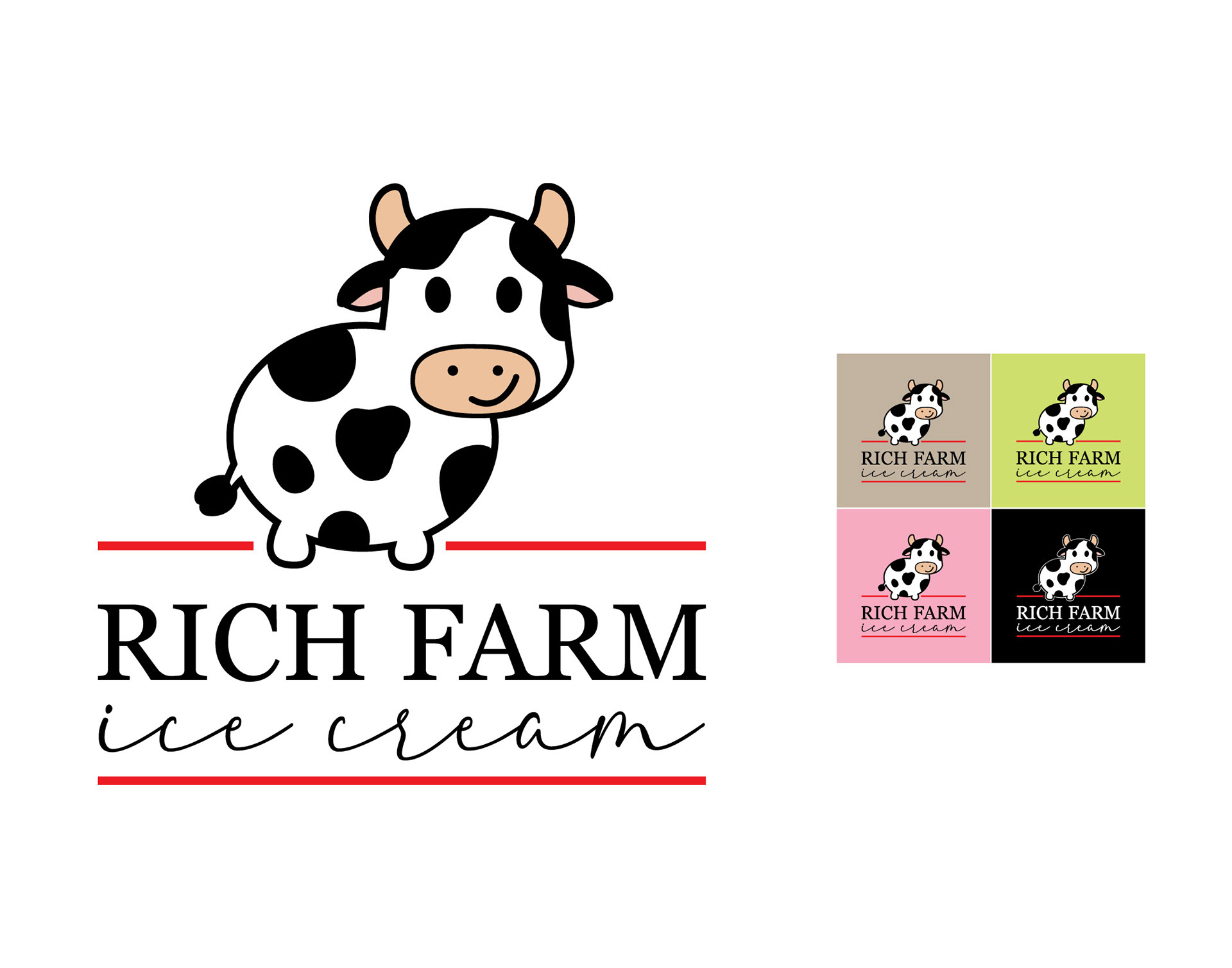
Rich Farm Ice Cream is a small-batch creamery known for its slow-churned, fresh ice cream and wide variety of flavors, including dairy-free options. With a longstanding reputation as a family-friendly destination, the brand evokes a sense of warmth, nostalgia, and community.
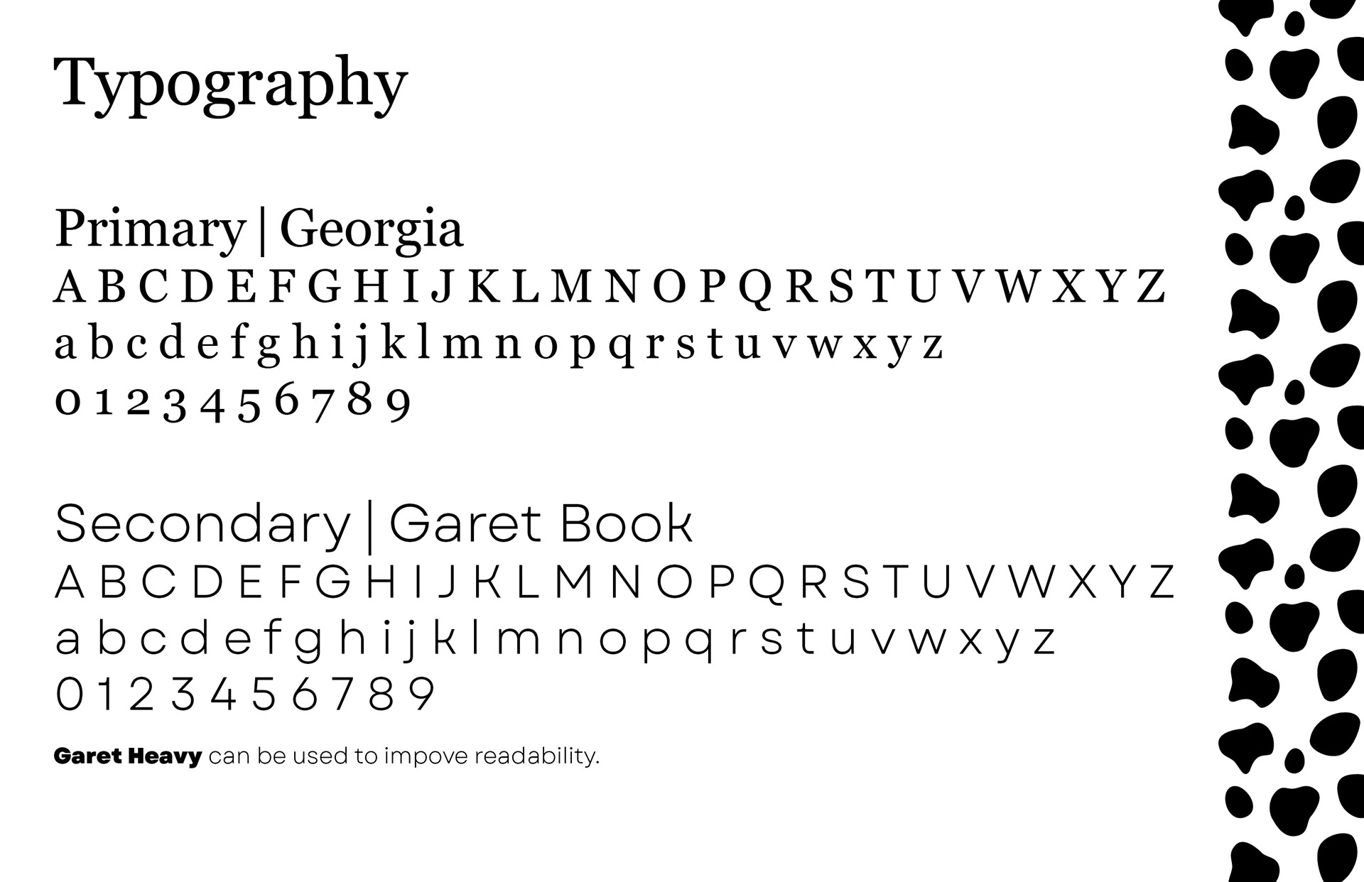
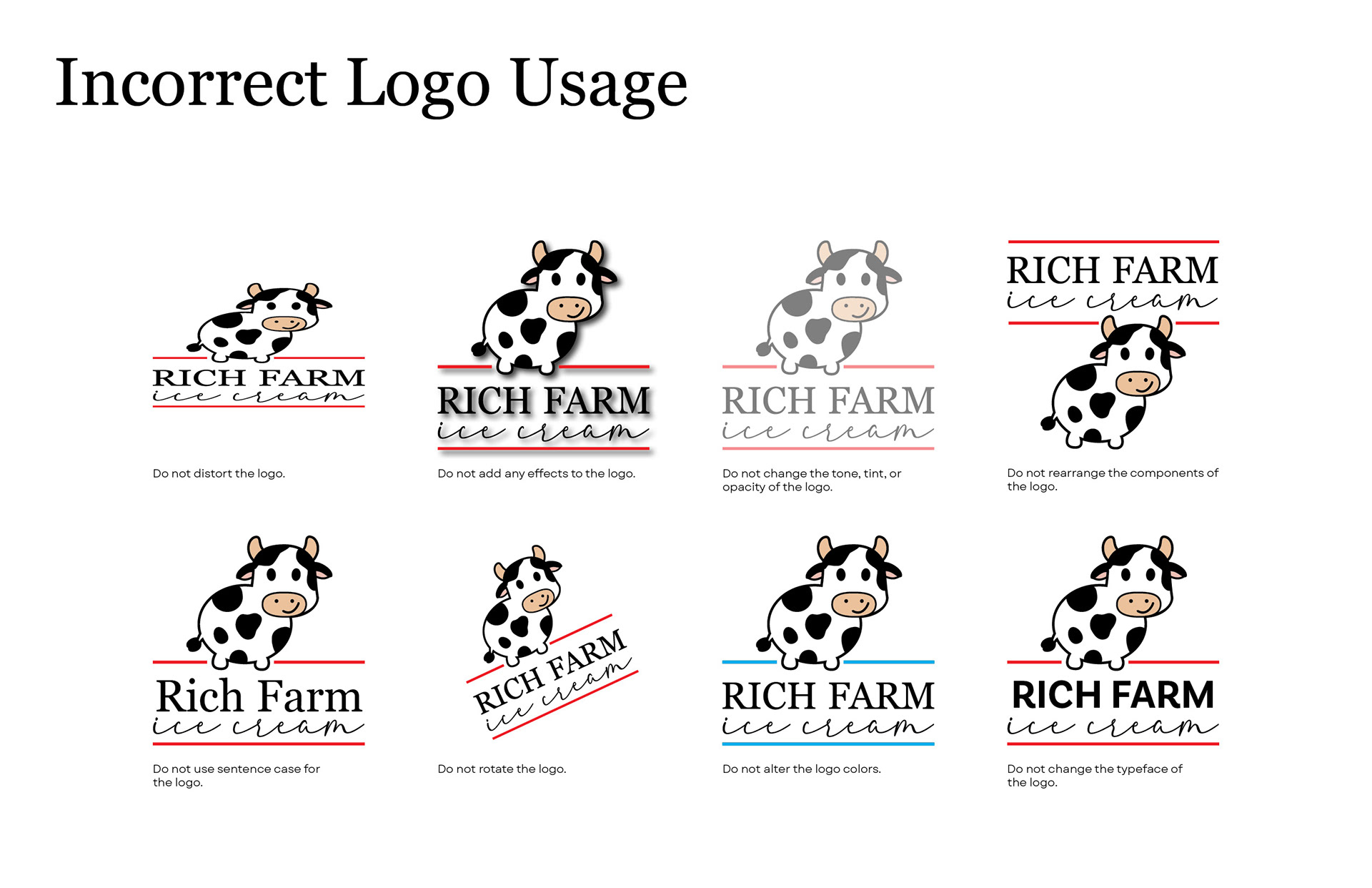
For this rebranding project, I redesigned the existing logo and developed a comprehensive brand style guide to support consistent implementation. The primary objective was to preserve the welcoming and nostalgic character of the original identity while refining it for improved clarity, scalability, and legibility. I created a versatile logo system featuring both a primary logo and a standalone pictorial mark that can be applied across signage, packaging, merchandise, and promotional materials. The accompanying style guide establishes standards for logo usage, color palette, typography, and visual consistency, providing a cohesive framework for the brand's future growth.

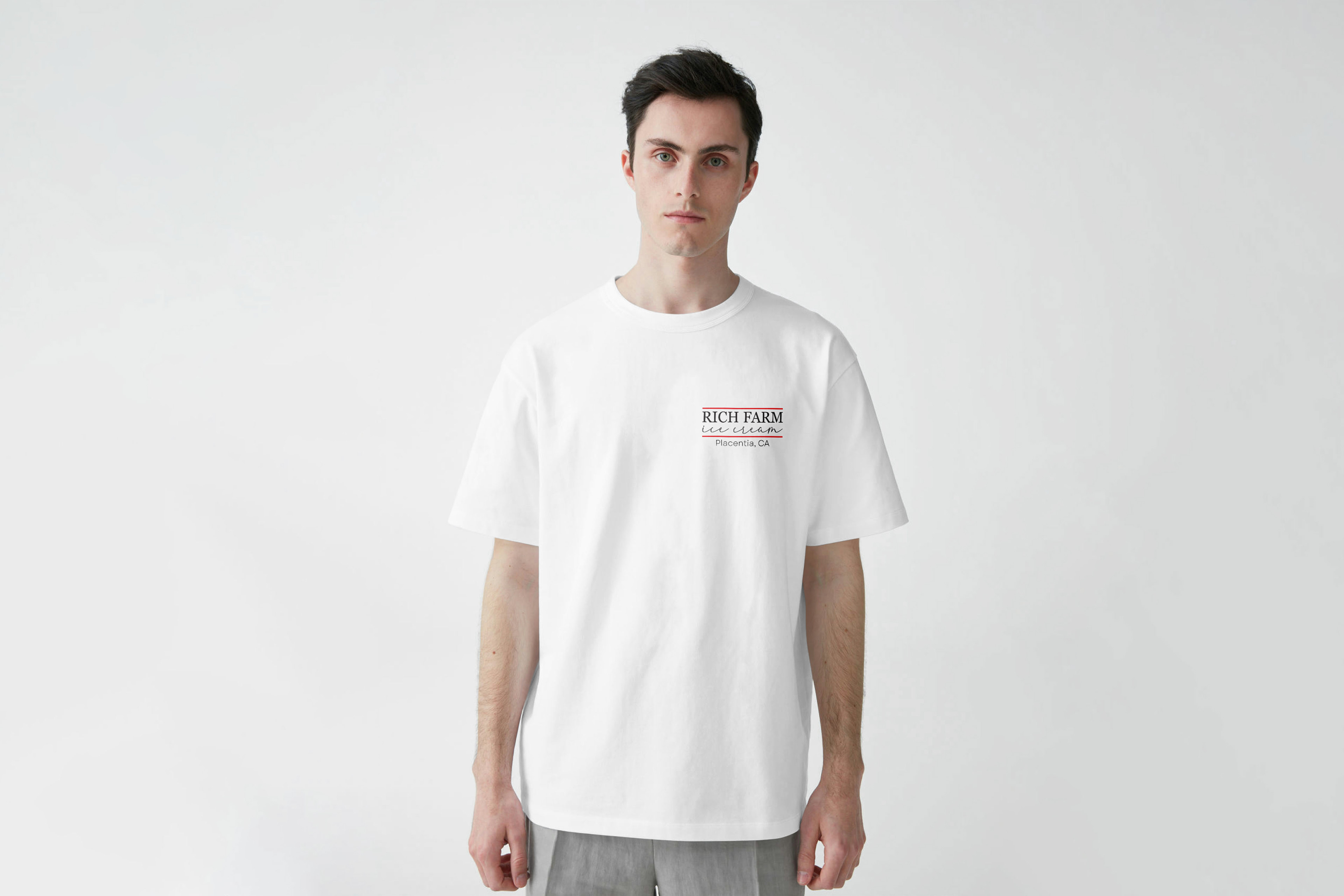
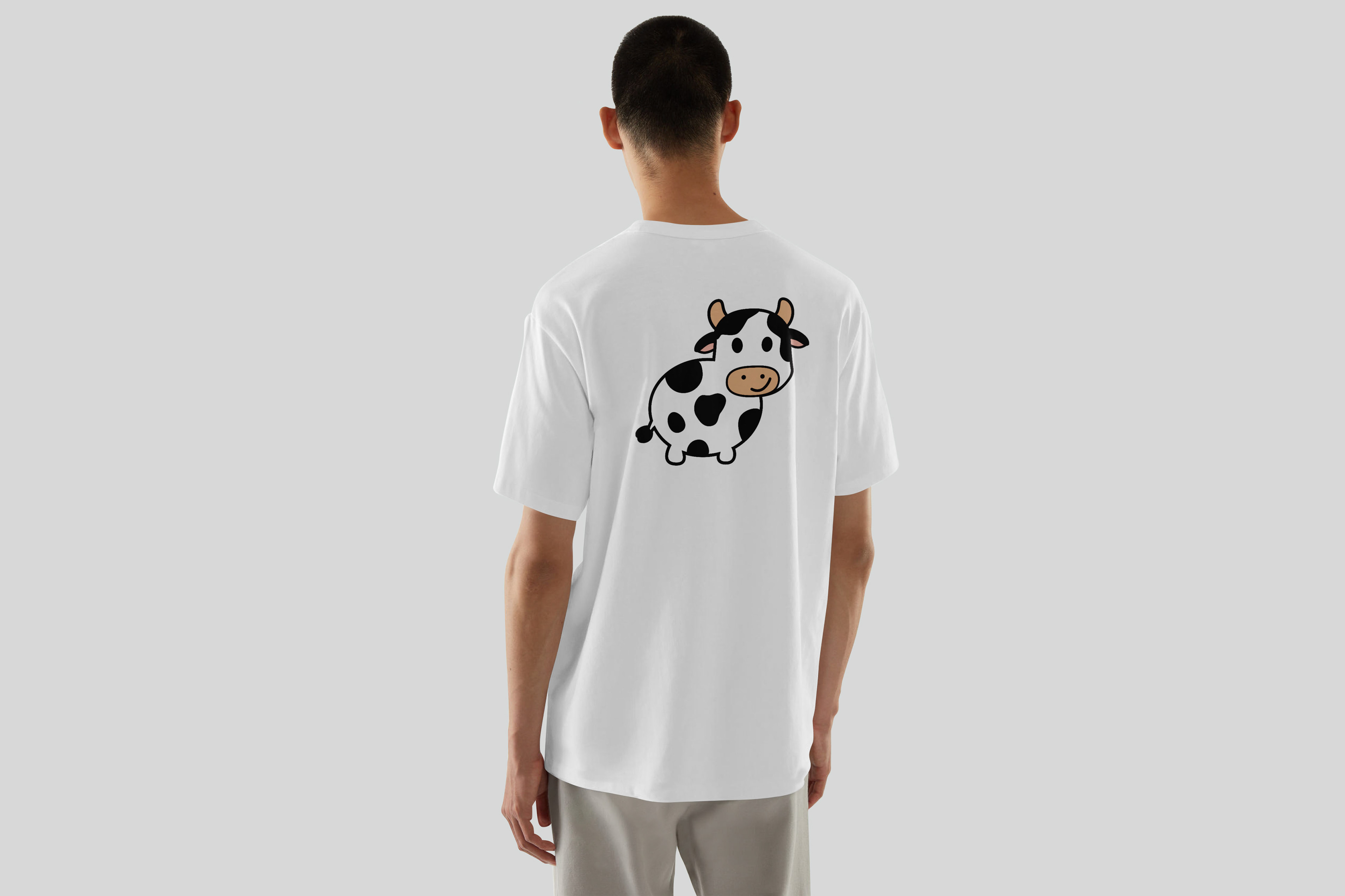
Front and back T-shirt design for merchandise sold in store.
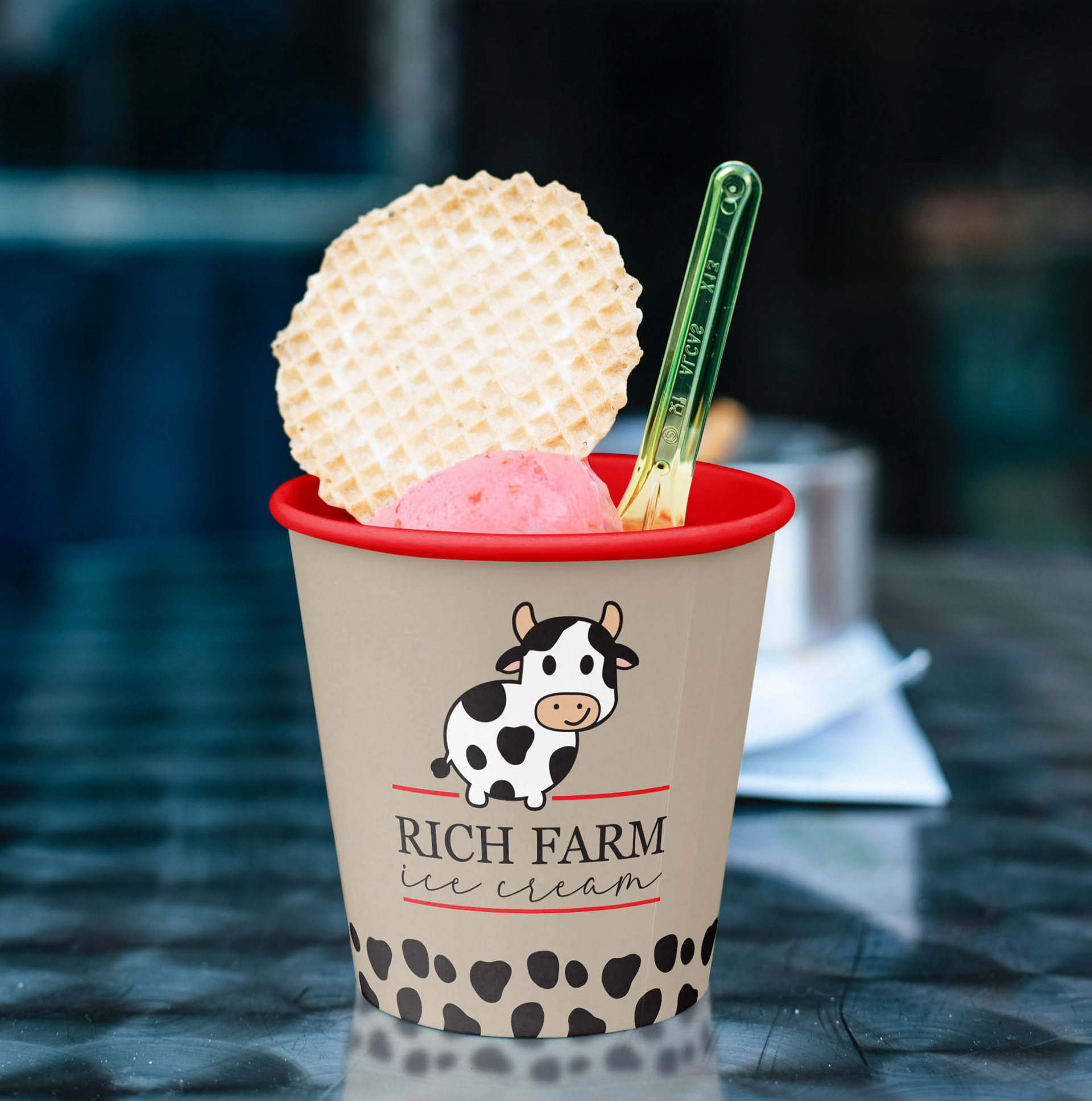
Ice cream cup design.
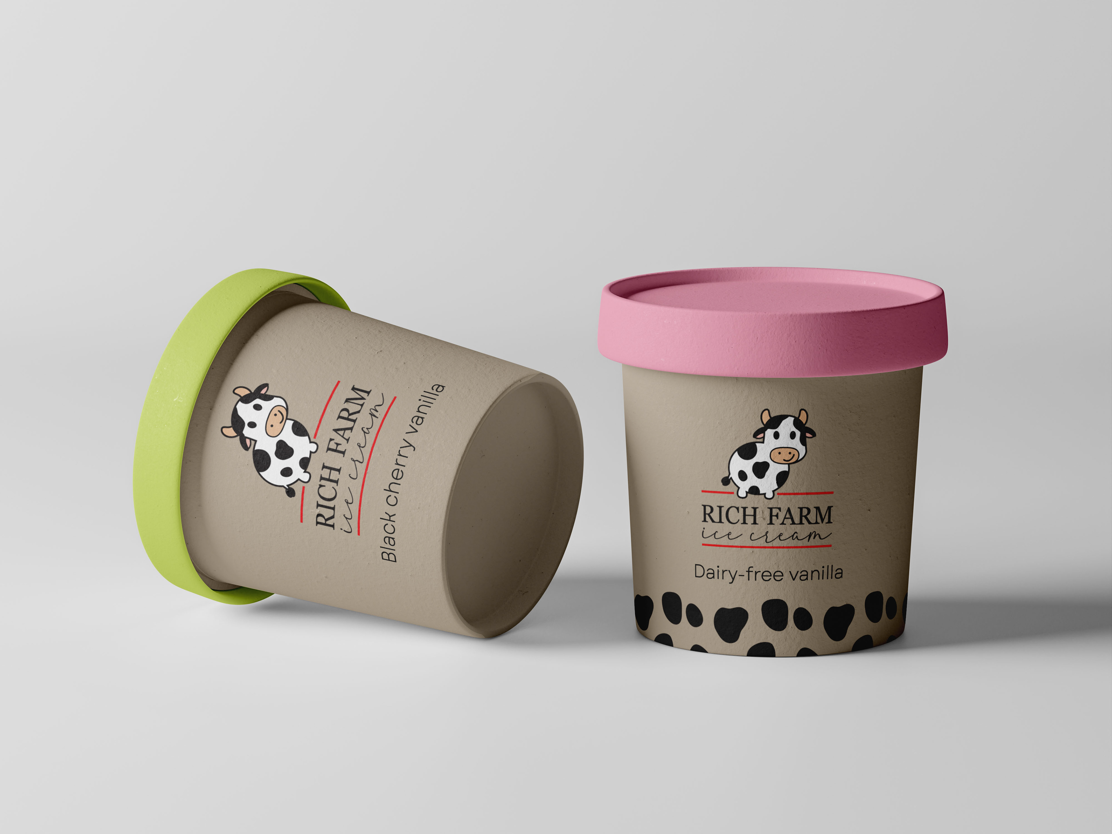
Designs for ice-cream pints sold in store, with cow-print graphic to make dairy-free options easily identifiable.

Food truck design for catering and special events.
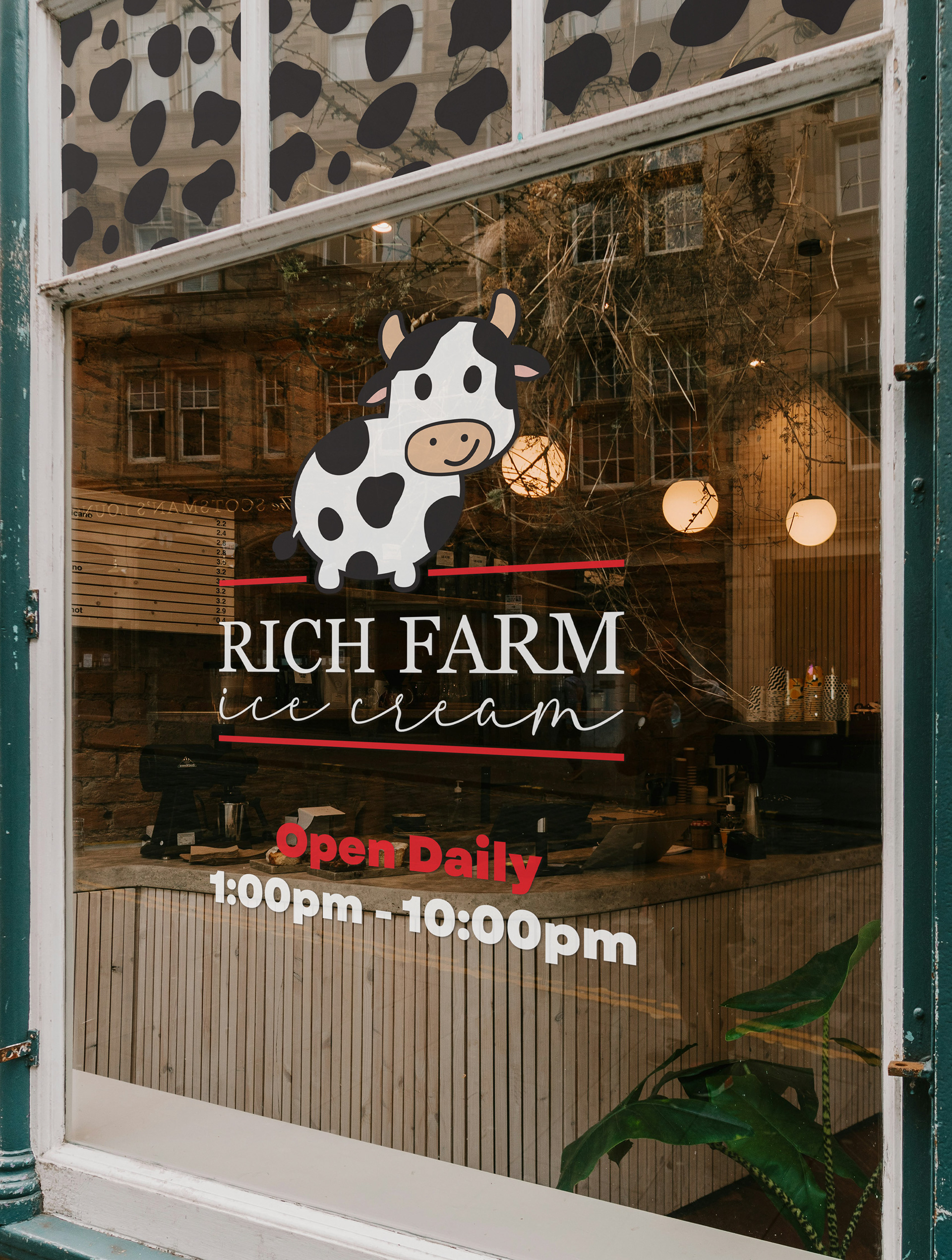
Storefront design with cow-print motif.
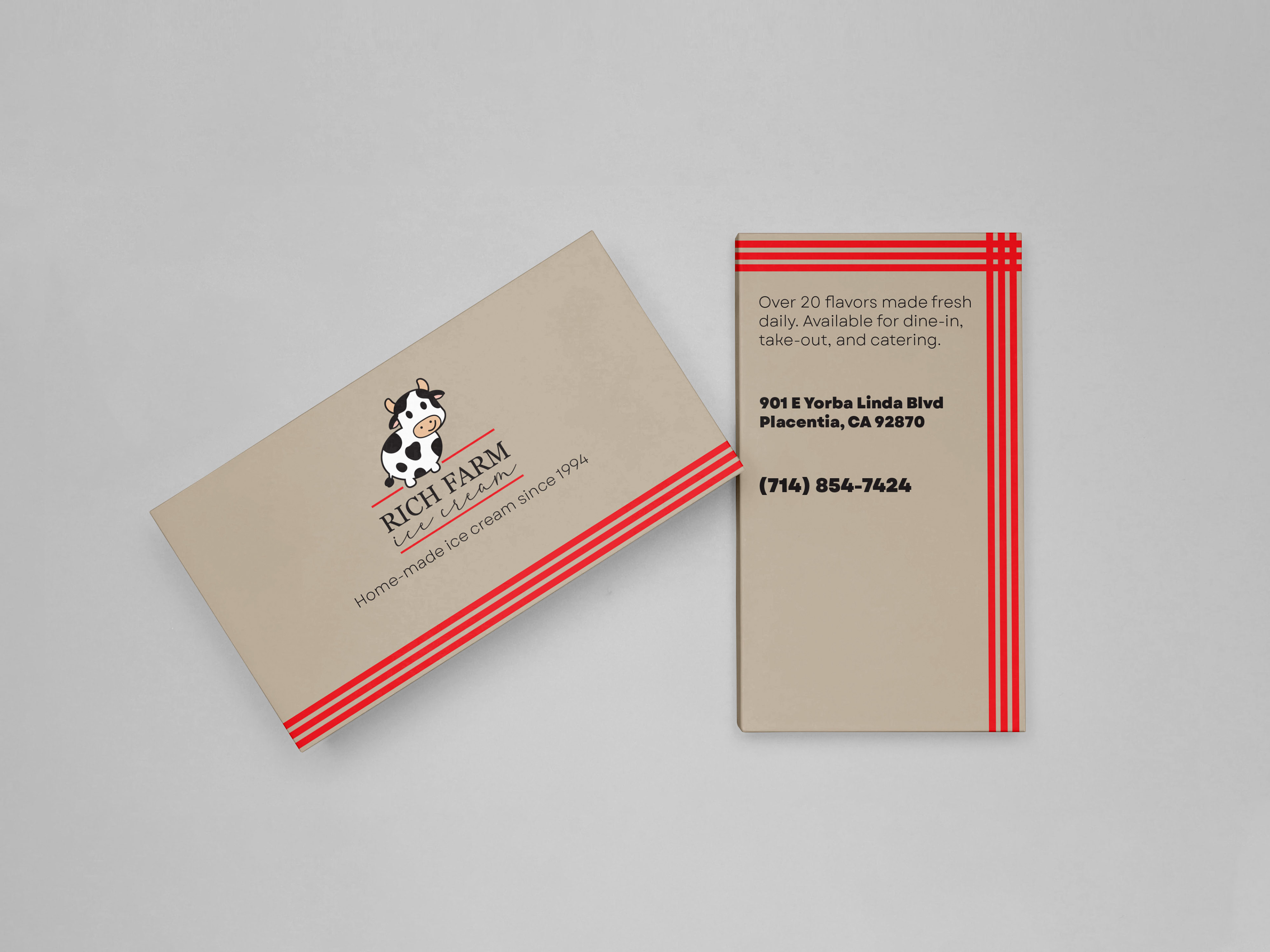
Business card design.
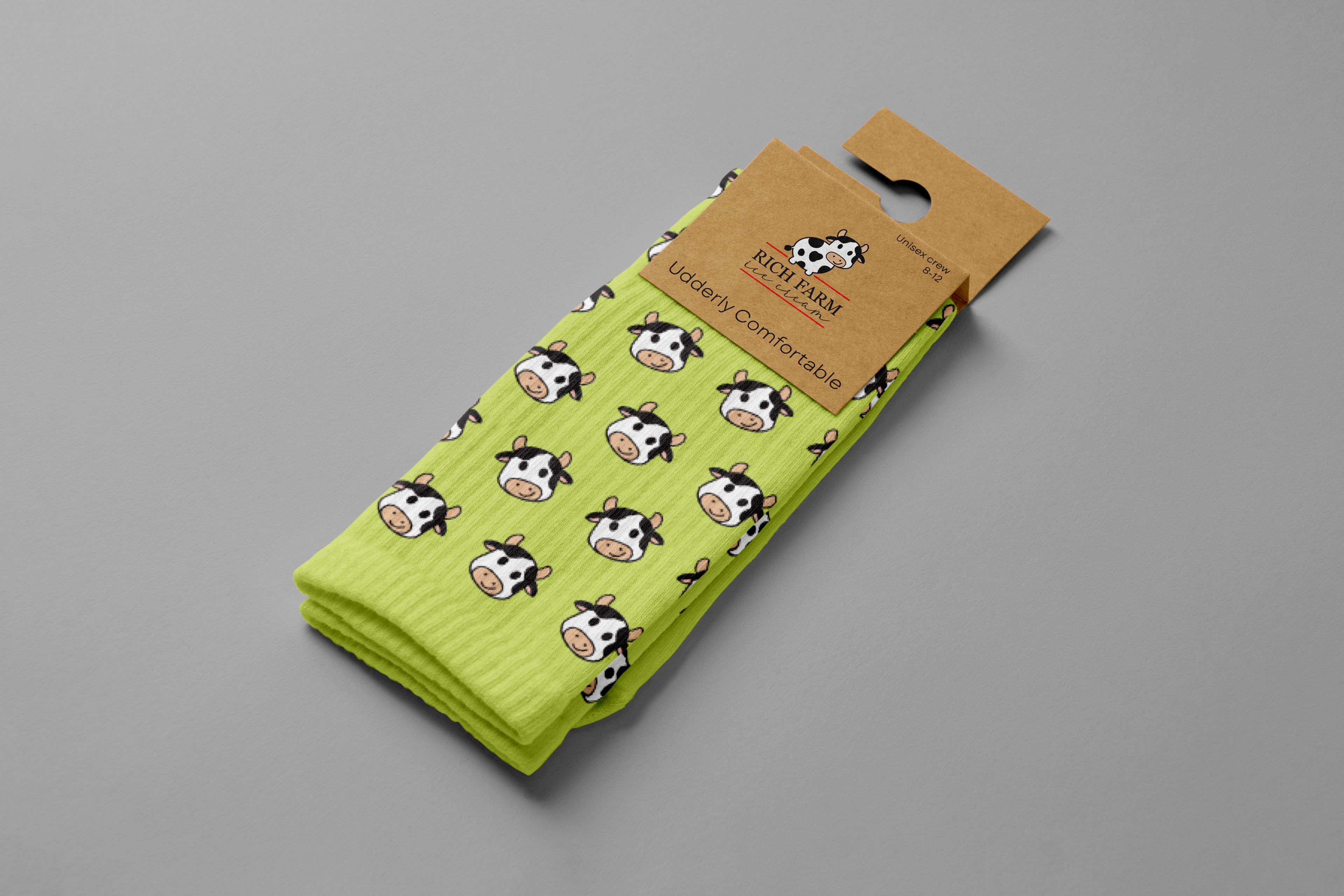
Merchandise featuring pictorial mark.
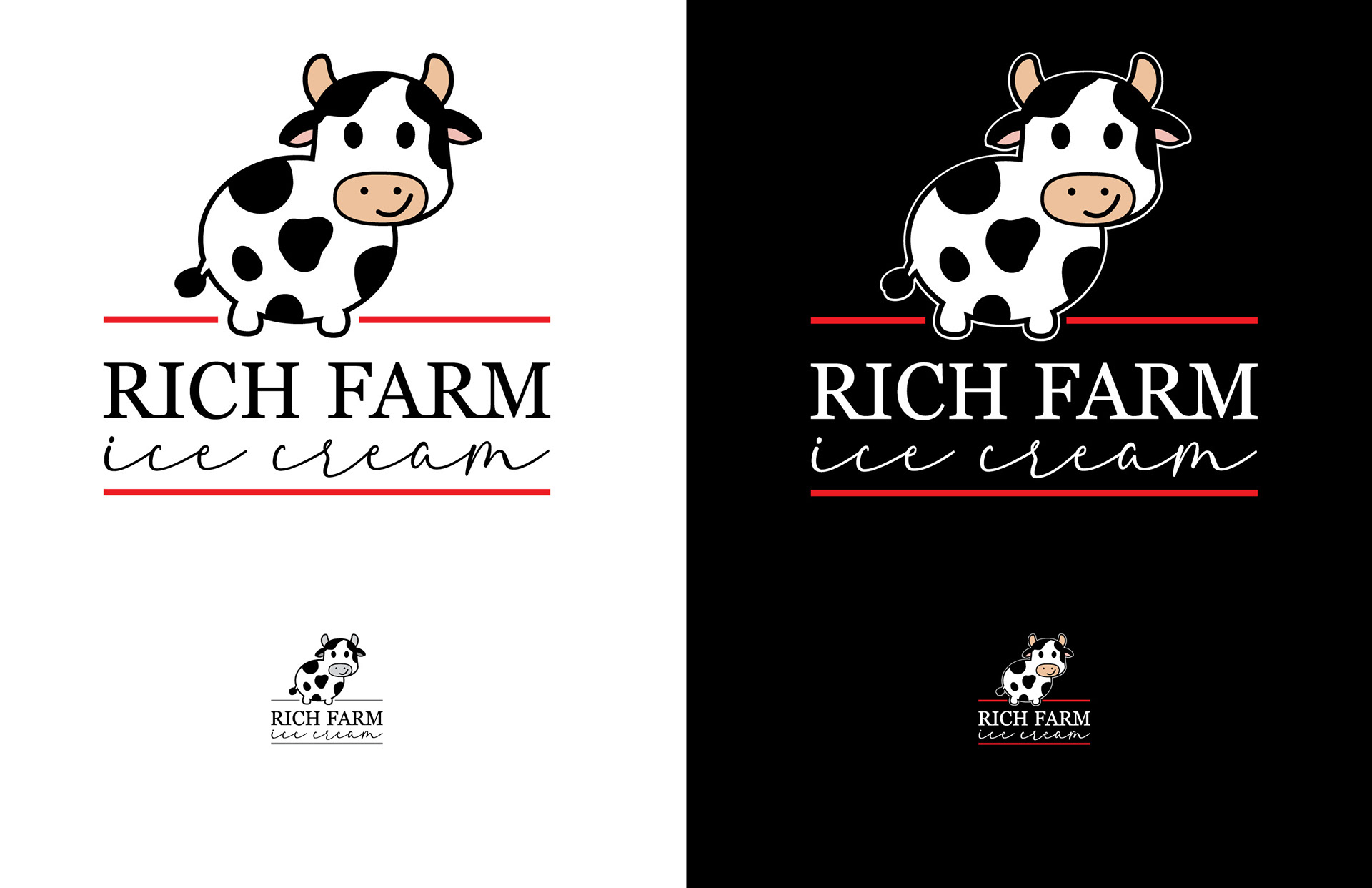
Logo and scaled logo on light and dark backgrounds.